// UX & Digital @ CDM Smith
City & County of Honolulu: ENV Sewer Fee Rates
Lead Graphic Designer / UX • CDM Smith
A year-long public outreach effort, with community meetings and a self-serve bill calculator, that helped every resident understand Honolulu's first sewer-rate increase since 2016 and see their own new bill.
Challenge
ENV's first sewer-rate increase since 2016 was hard news. Residents needed to understand why, to compare their old bill against their new one, and to know help was available if they couldn't afford it.
Solution
I designed the outreach graphics, partnered with ENV stakeholders to build a self-serve bill calculator, and prototyped a clear, easy-to-follow landing page in Figma, then handed it to the web team that built and launched it.
Impact
Made a sensitive message transparent and accessible to every resident, and grew a graphics engagement into UX, a calculator, and a web redesign.

// UX & Digital
AHRMA.org: Usability Evaluation & Redesign
UX Researcher & Designer • ASU
A seven-method research cycle, led by a heuristic evaluation, that turned a hard-to-use site for 3,000+ members into a validated, mobile-first redesign.
Challenge
AHRMA.org serves 3,000+ members, but core tasks failed: the join flow dead-ended on a third-party site, the navigation broke for everyone, and 80% felt overwhelmed by the structure.
Solution
I ran a seven-method research cycle, starting with a heuristic evaluation, then designed and validated a flattened, mobile-first redesign with a clear “Join Now” CTA and visual, tile-based pages.
Impact
Task-success rose from 74% to 100% in testing, and several fixes were adopted into production by AHRMA’s Board of Trustees.

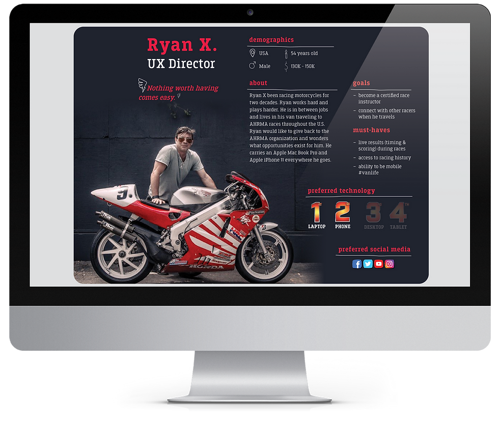
Personas & User Stories:
Three data-driven personas, each mapped to user stories with clear acceptance criteria.


Heuristic Evaluation:
Every issue rated by severity against Nielsen’s 10 heuristics.
Prototype Test:
Designed a high-fidelity prototype from the usability findings, then re-tested it to confirm the fixes worked.
Recommendations — presented to AHRMA's Board of Trustees; several were adopted, including the "Join Now" CTA and a flattened nav.
Balancing a heritage brand with modern usability meant respecting the vintage-racing identity while removing the friction around it. Severity-ranking every issue mattered most: it let a volunteer-run organization see exactly which fixes to make first for the biggest impact. Skills demonstrated: Heuristic Evaluation • Moderated Usability Testing • Personas & User Stories • Information Architecture • Content Audit • Prototyping (Adobe XD) • Data Analysis & Reporting • Information Design
Prototype Test Recommendations:
Showed a 100% task-success rate and a more user-friendly experience, with every participant completing every task and preferring the new design.


// UX & Digital
Food (In)Security Interface:
UX Research & Redesign
UX Reseacher & Designer • ASU
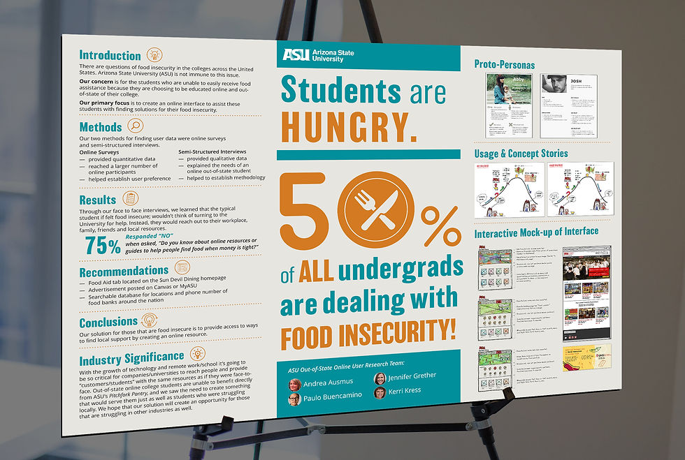
A UX research project reimagining how food-insecure college students find help online. Our 4-person ASU team took 2nd place from Association for Computing Machinery (ACM) Special Interest Group on Design of Communication (SIGDOC), and the award-winning abstract was selected for the Microsoft-sponsored, international ACM Student Research Competition (SRC), presenting our original research at the 37th ACM SIGDOC Conference in Portland, Oregon.
Challenge
Out-of-state online students can't walk into a campus food pantry, and the online resources that existed were buried and easy to miss. Many students also avoid asking the university for help, so the experience had to feel private and self-serve.
Solution
A 'Food Aid' section added to the main navigation, anchored by an interactive Food Locator map (enter a zip to find nearby pantries) and clear resource tiles: findable, private, and stigma-free.
Impact
Gave food-insecure online students a faster, more dignified way to find help, and showed how research-led information architecture can make a sensitive service easy to reach without anyone having to ask.
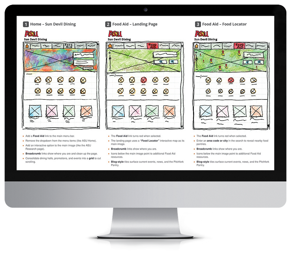
User Story & Wireframing:
Adding a "Food Aid" path to Sun Devil Dining.
The user story drives three screens: a way in (Home), a place to look (Food Aid), and a tool to act (Food Locator).